I've had a ridiculous amount of weeds to deal with this spring. It's probably mainly due to the fact that I have very little mulch protection in a couple of my beds. The weed seeds just fall and germinate. It's awful! I wanted to knock out as many weeds as possible before my plants started to leaf out. I didn't want the weeds to shade my good bedding plants! Mulch can be a good weed preventer since it restricts access to the soil. Plants in your garden beds and lawn grass that is cut at 3.5" tall, help to shade the dirt and prevent weed seed germination.
I love how green things are getting in my lawn and garden now, and I can't hardly wait until they have leafed out completely! The photo below shows my backyard and shady garden as of today. You can see ferns and hostas and other plants are really starting to grow now. I'll post another picture in a week or two so you can see the progress!
Monday, April 30, 2007
Poppin' Pastels Part II
A few days ago, I posted instructions for the traditional Poppin' Pastels technique. Here is another way to do it using the same supplies (see supplies below). Ink your stamp with Versamark or Embossing Ink. Then, quickly turn your stamp over and apply the chalk directly to the stamp. You can color different parts of the stamp different colors. For example, in my photo, I colored the flower petals with Orchid Opulence chalk and the flower center with YoYo Yellow. After coloring the stamp, huff on it and stamp it onto your paper.
It gives you a similar effect as before, except you don't see the chalk on the paper around the image. You only see color on the stamped image itself!
Labels:
paper,
paper craft,
poppin pastels,
rubber stamps,
splitcoaststampers,
stampin' up
Thursday, April 26, 2007
Poppin' Pastels Tutorial
One great way to utilize a wide variety of colors, without buying the inkpads, is to use a technique called "Poppin' Pastels." You use pastels or chalk and Versamark or embossing ink for this technique.
The first thing you need to do is gather all of your materials. You'll have to work quickly once you get started, so you won't have time to hunt for materials. If your craft area is as messy as mine, it could take a while to find something!
I use a Q-tip to apply my pastels, but you could use another applicator such as a stiff paint brush. I also have my pastels, the stamp I want to use, and my Versamark pad handy. I have a small white square of paper that I'll be working with.
The first step is to stamp your image using the Versamark or embossing ink. I stamped mine over the entire square, but depending on the look you want, you may only need to stamp once. In either case, it pays to move quickly so the ink doesn't have the chance to dry before applying the chalk.
This brings us to the next step, chalk application. Simply rub your Q-tip (or other applicator) over the pastel square of the color of your choice.
Then, brush the Q-tip over the stamped area. You'll see the chalk (in my case Orchid Opulence) cover the paper, but it will show up very bright where you stamped your image. This is why it's called "poppin' pastels." The stamped area almost pops off the page!
After you have covered the entire stamped image or images, wipe the excess chalk off of the paper with a tissue.
After that, you can embellish the paper any way you want. Then, simply add it to your card!
The first thing you need to do is gather all of your materials. You'll have to work quickly once you get started, so you won't have time to hunt for materials. If your craft area is as messy as mine, it could take a while to find something!
I use a Q-tip to apply my pastels, but you could use another applicator such as a stiff paint brush. I also have my pastels, the stamp I want to use, and my Versamark pad handy. I have a small white square of paper that I'll be working with.
The first step is to stamp your image using the Versamark or embossing ink. I stamped mine over the entire square, but depending on the look you want, you may only need to stamp once. In either case, it pays to move quickly so the ink doesn't have the chance to dry before applying the chalk.
This brings us to the next step, chalk application. Simply rub your Q-tip (or other applicator) over the pastel square of the color of your choice.
Then, brush the Q-tip over the stamped area. You'll see the chalk (in my case Orchid Opulence) cover the paper, but it will show up very bright where you stamped your image. This is why it's called "poppin' pastels." The stamped area almost pops off the page!
After you have covered the entire stamped image or images, wipe the excess chalk off of the paper with a tissue.
After that, you can embellish the paper any way you want. Then, simply add it to your card!
Finished Product
Wednesday, April 25, 2007
Sketch of the day
As you may have read before, the Sketch Challenge over at Splitcoaststampers is my favorite one every week. This week was no different! This weeks challenge used one large background panel, another big panel offset to the left side, and another small item in the lower right hand corner of the big panel. I used Basic Grey's Blush and Lily Kate papers on my card. I doodled the brown and green panels to match the leaves and stems on the Lily Kate paper. The Blush Basic Grey paper has been sponged with Mellow Moss ink. I just love how soft and sweet this card turned out!
Tuesday, April 24, 2007
Spring inspired
We've been having some beautiful weather here in Northern Indiana the past few days. Temps have been warm, and the sun has been shining! All of the plants are starting to grow, and some of the early blooming plants are showing their color. This wonderful weather inspired a very springy floral card.
I used the Cuttlebug D'vine Swirl embossing folder to emboss the Barely Banana panel. Then, I swiped Certainly Celery ink over the top. The panel that the triple layered Prima flowers are attached to is Barely Banana paper that has been sponged with Pretty in Pink ink. It gave the paper a sort of apricot hue, which blended with the Prima flowers nicely. The Prima flowers are all attached with pewter brads, which have lime green stickles (glitter glue) on top. Lime green and Icicle stickles also adorn the edges of several panels.
The "Levi Tab" is made from Barely Banana cardstock and was stamped with Old Olive ink and sponged with Pretty in Pink ink. The "in life" text comes from Stampin' Up's "Delight in Life" stamp set, which the word "delight" on the green panel and the leaf behind the triple flower are from Stampin' Up's "Paint Prints."
Labels:
paper,
paper craft,
prima flowers,
rubber stamps,
stampin' up
Perennial divisions
In my area, Zone 5 of Northern Indiana, now is a great time for dividing perennials. It is really easy to find ideal spots for your divisions as the plants are sending up their shoots (see photo to right). For example, in my yard, I have lots of hostas. Hostas need to be divided every few years in order to perform well in the landscape. Due to their size and fairly delicate leaves, Hostas can be difficult to divide in the fall; although they can be divided in either the fall or spring. I prefer to do mine in the spring since it's so much easier.
By looking straight down onto a Hosta plant that needs to be divided, you will usually see some clumps of leaf shoots. They are often like small circles (see photo to left). In order to divide them up nicely, you will need to dig up the entire plant. First, be sure to remove any debris in and around the plant. You'll see in my photos, that fallen leaves litter the plant. They should be removed before starting this process. Start by digging a circle around the entire plant with your shovel. Your circle should be a few inches away from the edge of the plant. Then, use your shovel to gently lift the plant and all of it's roots. Once your plant is loose, you can use a shovel, spade, or other flat garden tool to divide the clumps. Simply slice through the plant, top to bottom, in the desired areas. Then, you can lift the divided clumps and plant them in new places or give them to friends. I planted mine in a new place in my shady garden, and then added a slow release fertilizer (see photo below). Regular water is also very important, as it is with any newly planted plant.
Labels:
garden,
hostas,
perennials,
plants,
spring,
spring chores
Thursday, April 19, 2007
Magazine Inspiration
Twisted Chick Creations a.k.a. Flaxychick (see my blog links to the right) challenged her blog readers to use a magazine ad as an inspiration for a card. As I was flipping through my House and Garden magazine, I saw an ad that would be PERFECT! The layers of the appliances immediately stood out as a fun card layout. The font colors (blues and lavender) inspired the color scheme. The font style inspired the swirly Cuttlebugged background (which I rubbed with Lavender metallic ink). The Harlequin style paper is made by My Mind's Eye. I used my "Like it a Latte" stamps for the coffee cup and the sentiment, because it was really the only kitchen related stamp set that I had! The steam for the coffee cup is stamped with Staz-on ink on acetate, and then cut out. I got the idea for that trick from "labullard" at Splitcoaststampers. Thanks for the idea Linda! The blue panel that the sentiment is stamped on is popped using 3-D Zots.
Primas, Primas, everywhere!
I just love Prima flowers. Prima flowers are just like any other fabric flower embellishment, but they aren't made of the thin slippery fabric that most faux flowers are made from. They are much thicker, and almost feel like a soft velvety paper. Their quality is a big step above most other flower embellishments. They are a little on the pricey side though, so you have to use them wisely, but you do get a lot of flowers in each container so I guess that makes up for the initial sticker-shock. They also come in really cute containers that can be re-used for something else. My favorite one is the one that looks like a milk bottle. It has a label that says "got flowers?" It's really way too cute!
So, yesterday, I got out my brand new Primas. They are little hydrangea blossoms, and for whatever reason, I was inspired to make an entire cluster of them. I love how this card turned out, but it's definitely one for hand-delivery only! I paper-pieced the stem and leaf, and arranged the primas so they looked similar to a real hydrangea cluster. Then, I used a small dot of "icicle" stickles in the center of each blossom. I also added dots of stickles on the cut-out corners of the green panels. This one was really fun and simple to make!
Monday, April 16, 2007
Trifold Card
Wow! This is a really fun style of card to make. Following Beate's tutorial on Splitcoaststampers, makes each step easy. Basically, the process goes like this. Cut a piece of cardstock to 3.5" by 10.5". Score it 3.5" in and 7" in from the left side. This gives you three equal panels. Score diagonals on each of the side panels, making sure they go in the same direction. Fold one square panel in, and then the triangle up. Then, fold the other square in, and then the triangle down. Add your decorative panels and images, and tie it all up with a ribbon. It's so simple and quick! Beate's tutorial (linked above) is much more detailed and shows step by step pictures, so I recommend reading the tutorial if you plan on making one.
I was inspired by my red and white floral designer paper. I love red and white as a color combo, but I don't typically use it. For some reason, I tend to stick to a softer color pallet. Anyway, I thought this was the perfect excuse to do something a little bit bolder. I used two layers of white Heidi Swapp flowers for my center image. Then, I added orange stickles to the inside of the flower. Stickles are a sparkly glitter glue, are acid free, and are really easy to apply to cards and scrapbook pages for accents. The interior of my card has the small flower image from Stampin' Up!'s Delight in Life set. I stamped it in Ruby Red ink, which matches my Ruby Red cardstock base.
Labels:
cards,
flowers,
greeting cards,
paper craft,
rubber stamps,
stampin' up
Friday, April 13, 2007
Argyle Inspiration
The layout for this card came from the Sketch Challenge at Splitcoaststampers this week. It had lots of layers, which always means a fun and challenging card-making experience for me! As I went down to the basement to work on the card, I really didn't have any particular color or image scheme in mind. But, when I saw my argyle ribbon laying there, I knew I just had to use it! The ribbon inspired the color scheme and the image choice. The colors reminded me of a 40s or 50s coffee shop, so I used the "Like it a Latte" stamp set for my images. I used Stickles (glitter glue) to make the foam, straws, heart, and outline of the mug sparkle.
Labels:
argyle,
cards,
coffee,
greeting cards,
rubber stamps,
splitcoaststampers
Wednesday, April 11, 2007
Fickle Mother Nature
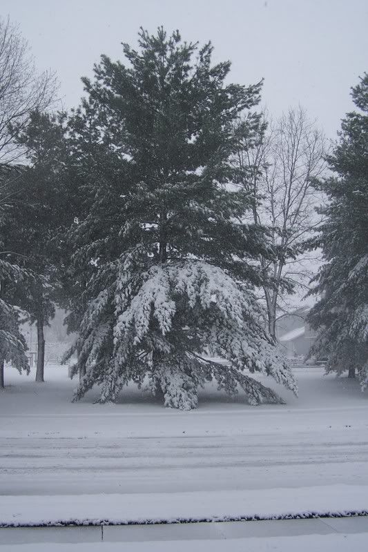
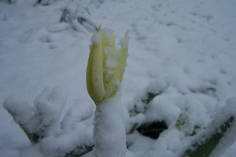
This morning was a real shocker. I woke up to a blanket of really heavy, wet snow on my lawn, garden, and trees. Snow alone really isn't all that bad for the plants. It can actually offer plants some protection from cold air temps. Today, however, wasn't really all that cold. It was around freezing, so everything is really wet and slushy. We've also been getting sleet, which is no fun either. On the plus side, I think the snow is absolutely gorgeous, and I do love images of snow on plants and flowers.
Tuesday, April 10, 2007
Coffee beans
This card uses two similar techniques, masking and reverse-masking. Masking is a simple technique that allows you to use only part of a stamp for your image. It's handy for layering images in front of one another. In this case, I masked the interior of the coffee cup. I did this by stamping the coffee cup on a scrap piece of paper, cutting the center out, and using that center cut-out to "mask" the center of the stamped image on my pink cardstock. So, when I stamped it, it only showed the outline of the coffee cup. Then, I did reverse masking. I used the other part of the scrap paper that I cut (which had the outline of the cup on it), and used that as a reverse mask. It basically covered the outline of the coffee cup on the pink cardstock, so I could fill in the center with something else. I filled the center with Creamy Caramel sponged ink, and then with coffee beans in Basic Brown. It's a fun technique that I'm sure I'll be using many times over again in the future.
There's an excellent tutorial by Beate at Splitcoaststampers. It shows pictures of how to do this fun technique!
Reverse Masking Tutorial at SCS
There's an excellent tutorial by Beate at Splitcoaststampers. It shows pictures of how to do this fun technique!
Reverse Masking Tutorial at SCS
Labels:
coffee,
paper,
paper craft,
stampin' up,
thank you card
Monday, April 9, 2007
I've been out of town for a few days, but I'm back home and crafting again. Unfortunately, I can't do anything in the garden since it's so cold and snowy again. But, that gave me a little time to stamp this evening.
Today's challenge at SCS was to CASE (copy and change a few things) a card of a fellow stamper named HB. She had many gorgeous cards in her gallery, but when I stumbled on her fishy card I knew it was the one I would choose. You see, I just got an order of Stickles (glitter glue) in the mail the other day, and I thought a fish card would be the perfect excuse to use them! So, I got to work making a similar card. I changed a few of the stamps and modified the tag. I also did sponging and doodling. It's a really cheery card, and it looks great in real life. The glitter looks a little funny in the photo, but it doesn't look that odd in person.
Tuesday, April 3, 2007
Cold weather 'a comin'
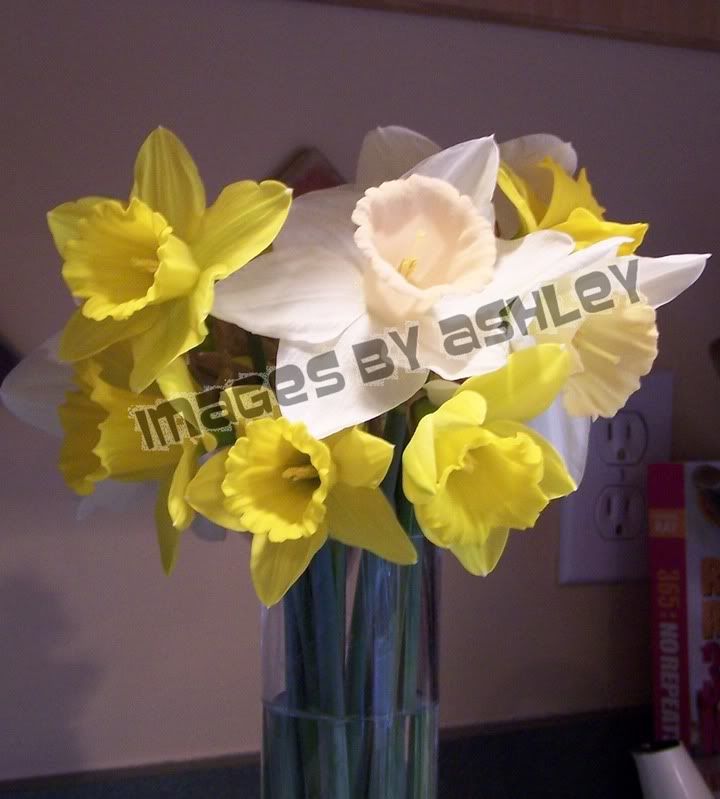
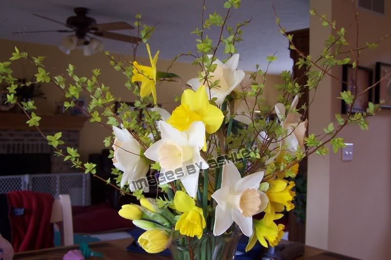
Well, this unusually warm, spring-like weather is about to end for us here in Northern Indiana. We are supposed to get severe storms this evening and snow by tomorrow morning! Compared with today, which is about 70 degrees, this will be a really frigid blast. I figured that my blooming daffodils will either be beaten by the storms this evening or ruined by the cold air, so I cut most of the ones that were already in bloom. I am leaving all the ones with buds and ones that don't even have buds yet, hoping that the freezing cold doesn't do any damage to them.
On the bright side of this all, I was able to bring some gorgeous daffodils inside for some springy flower arrangements. I even cut some spirea branches and used them to accent the daffodils in my larger vase. They are brightening up my kitchen, and giving me some hope that spring will return again.
Monday, April 2, 2007
Faux Shaving Cream
What a COOL technique this is! The challenge on SCS today was to make a card using the faux shaving cream technique. Basically, you take a solid image stamp (like Big Blossom on mine) and ink it up with whatever color you choose. Then, you take a smaller image, inked in a different color, and kiss the solid image with it. When you kiss it, you also swirl it a little. This give a really cool, almost tie-dye like, effect.
For my card, I used Big Blossom for the large image, and the medium flower from Paint Prints for the kissing. I used a brayer to ink my Big Blossom in Pretty in Pink ink. Then I kissed it with the Paint Prints flower in Perfect Plum. I used purple stickles to dress up the center of the flower. My background panel is Mellow Moss cardstock that was embossed with my Cuttlebug. I swiped the embossed areas with Perfect Plum ink. The base paper of my card is Perfect Plum.
This card was very fun and easy to make, and the faux shaving cream technique gives a really neat effect!
Subscribe to:
Posts (Atom)